The separator element specifies a vertical separator line between two sets of controls. It spans from the top of the group to the bottom of the group, and cannot be set to any other orientation or size. It can, however, provide whitespace on the Ribbon, similar to the space that you can create using a vertical box control.
Graphical View of separator Attributes
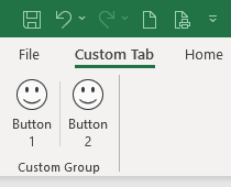
The following example shows a vertical separator control between two buttons:
This is specified using the following XML:
<customUI xmlns="http://schemas.microsoft.com/office/2009/07/customui">
	<ribbon>
		<tabs>
			<tab id="customTab"
			     insertBeforeMso="TabHome"
			     label="Custom Tab">
				<group id="customGroup"
				       label="Custom Group">
					<button id="btnHappy1"
					        imageMso="HappyFace"
					        label="Button 1"
					        size="large"/>
					<separator id="sep1"/>
					<button id="btnHappy2"
					        imageMso="HappyFace"
					        label="Button 2"
					        size="large"/>
				</group>
			</tab>
		</tabs>
	</ribbon>
</customUI>
Parent Elements
- documentControl
- group
- sharedControl
Children Elements
The separator does not support child controls of any kind.
Required Attributes
The id and idQ attributes are mutually exclusive. At least one of these attributes MUST be specified.
| ATTRIBUTE | WHEN TO USE |
|---|---|
| id | Create your own separator |
| idQ | Create a separator shared between namespaces |
Optional insert Attributes
The insertAfterMso, insertAfterQ, insertBeforeMso, and insertBeforeQ attributes are mutually exclusive. If none of these attributes are specified, the controls SHOULD be appended to the existing set of controls, in the order they are defined in the XML.
| INSERT ATTRIBUTE | ALLOWED VALUES | DEFAULT VALUE | WHEN TO USE |
|---|---|---|---|
| insertAfterMso | Valid Mso Group | Insert at end of group | Insert after built-in control |
| insertBeforeMso | Valid Mso Group | Insert at end of group | Insert before built-in control |
| insertAfterQ | Valid Group idQ | Insert at end of group | Insert after shared namespace control |
| insertBeforeQ | Valid Group idQ | Insert at end of group | Insert before shared namespace control |
Optional Attributes and Callbacks
| STATIC ATTRIBUTE | DYNAMIC ATTRIBUTE | ALLOWED VALUES | DEFAULT VALUE | VBA CALLBACK SIGNATURE FOR DYNAMIC ATTRIBUTE |
|---|---|---|---|---|
| visible | getVisible | true, false, 1, 0 | true | Sub GetVisible (control As IRibbonControl, ByRef returnedVal) |
Using Built-in separator Controls
The separator element is essentially a visible line. Since it would take us much more typing to refer to a built-in version than to just create our own, there is absolutely no reason for us to use one of Microsoft’s built in separator controls, even if we could access them.
Creating Custom separator Controls
Because the separator control has one primary function and very few options, this example shows how you can use the separator to create whitespace on the Ribbon. One of the key benefits of the separator is that it forces a break between controls, so the whitespace is preserved without the effort of adding nested box controls.
We demonstrate this using the example we used earlier in the "Horizontal Alignment" section of the box example. Place the following code after the </box> line:
<separator id="sep1"/>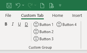
Full XML code
Copy and paste the following XML code into customUI14.xml. If you don't know how to do it, read this article: Creating a Custom Ribbon.
<customUI xmlns="http://schemas.microsoft.com/office/2009/07/customui">
	<ribbon>
		<tabs>
			<tab id="customTab"
			     insertBeforeMso="TabHome"
			     label="Custom Tab">
				<group id="customGroup"
				       label="Custom Group">
					<box id="boxFormat1"
					     boxStyle="horizontal"
					     visible="true">
						<toggleButton idMso="Bold"/>
						<toggleButton idMso="Italic"/>
						<toggleButton idMso="Underline"/>
						<toggleButton idMso="UnderlineDouble"/>
					</box>
					<separator id="sep1"/>
					<button id="btnHappy1"
					        imageMso="HappyFace"
					        label="Button 1"/>
					<button id="btnHappy2"
					        imageMso="HappyFace"
					        label="Button 2"/>
					<button id="btnHappy3"
					        imageMso="HappyFace"
					        label="Button 3"/>
					<button id="btnHappy4"
					        imageMso="HappyFace"
					        label="Button 4"/>
				</group>
			</tab>
		</tabs>
	</ribbon>
</customUI>