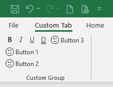
The buttonGroup element specifies a grouping container that groups controls together visually. The child controls are laid out horizontally.
Differences Between the box and buttonGroup Elements
The buttonGroup element is similar to the box element but it has some unique features as well.
The biggest difference in appearance between the buttonGroup and the box controls is that although the box does not place a visible perimeter around the group, the buttonGroup element actually displays a border, but it seems to be removed in Excel 2021 and later.
The buttonGroup cannot be aligned vertically, however, and unlike the box, it will not accept either the box or buttonGroup elements as children.
| ABILITY | BOX | BUTTONGROUP |
|---|---|---|
| Align controls horizontally | ✓ | ✓ |
| Align controls vertically | ✓ | |
| Will accept a nested box control | ✓ | |
| Will accept a nested buttonGroup control | ✓ | |
| Places a visible outline around the controls | ✓ |
Visible outlines around controls appear to be removed in Excel 2021 and later.
Graphical View of buttonGroup Attributes
The following figure clearly shows how the buttonGroup appears in the group.

This is specified using the following XML:
<customUI xmlns="http://schemas.microsoft.com/office/2009/07/customui">
	<ribbon>
		<tabs>
			<tab id="customTab"
			     insertBeforeMso="TabHome"
			     label="Custom Tab">
				<group id="customGroup"
				       label="Custom Group">
					<buttonGroup id="bgrpMsoControls">
						<toggleButton idMso="Bold"/>
						<toggleButton idMso="Italic"/>
						<toggleButton idMso="Underline"/>
						<toggleButton idMso="UnderlineDouble"/>
					</buttonGroup>
					<button id="btnHappy1"
					        imageMso="HappyFace"
					        label="Button 1"/>
					<button id="btnHappy2"
					        imageMso="HappyFace"
					        label="Button 2"/>
					<button id="btnHappy3"
					        imageMso="HappyFace"
					        label="Button 3"/>
				</group>
			</tab>
		</tabs>
	</ribbon>
</customUI>
Children Elements
- button
- control
- dynamicMenu
- gallery
- menu
- splitButton
- toggleButton
Parent Elements
Required Attributes
The id and idQ attributes are mutually exclusive. At least one of these attributes MUST be specified.
| ATTRIBUTE | WHEN TO USE |
|---|---|
| id | Create your own buttonGroup |
| idQ | Create a buttonGroup shared between namespaces |
To save you some time searching for something that isn’t there, Microsoft does not provide any built-in buttonGroup elements, so the idMso attribute cannot be specified.
Optional insert Attributes
The insertAfterMso, insertAfterQ, insertBeforeMso, and insertBeforeQ attributes are mutually exclusive. If none of these attributes are specified, the controls SHOULD be appended to the existing set of controls, in the order they are defined in the XML.
| INSERT ATTRIBUTE | ALLOWED VALUES | DEFAULT VALUE | WHEN TO USE |
|---|---|---|---|
| insertAfterMso | Valid Mso Group | Insert at end of group | Insert after built-in control |
| insertBeforeMso | Valid Mso Group | Insert at end of group | Insert before built-in control |
| insertAfterQ | Valid Group idQ | Insert at end of group | Insert after shared namespace control |
| insertBeforeQ | Valid Group idQ | Insert at end of group | Insert before shared namespace control |
Optional Attributes and Callbacks
| STATIC ATTRIBUTE | DYNAMIC ATTRIBUTE | ALLOWED VALUES | DEFAULT VALUE | VBA CALLBACK SIGNATURE FOR DYNAMIC ATTRIBUTE |
|---|---|---|---|---|
| visible | getVisible | true, false, 1, 0 | True | Sub GetVisible (control As IRibbonControl, ByRef returnedVal) |
Using Built-in buttonGroup Controls
Like the box element, the only purpose of the buttonGroup element is to group other controls, so it makes sense that Microsoft does not expose any built-in buttonGroup controls for use as commands. Therefore, there it has no need for an idMso.
Creating Custom buttonGroup Controls
In the following example, the buttonGroup control is wrapped in a vertical box control. As mentioned before, using the box control enables you to reserve the whitespace under your controls by forcing all the button controls into the next column.
Copy and paste the following XML code into customUI14.xml. This example won't require using any VBA code. If you don't know how to do it, read this article: Creating a Custom Ribbon.
<customUI xmlns="http://schemas.microsoft.com/office/2009/07/customui">
	<ribbon>
		<tabs>
			<tab id="customTab"
			     insertBeforeMso="TabHome"
			     label="Custom Tab">
				<group id="customGroup"
				       label="Custom Group">
					<box id="boxCustom"
					     boxStyle="vertical">
						<buttonGroup id="bgrpMsoControls">
							<toggleButton idMso="Bold"/>
							<toggleButton idMso="Italic"/>
							<toggleButton idMso="Underline"/>
							<toggleButton idMso="UnderlineDouble"/>
						</buttonGroup>
					</box>
					<button id="btnHappy1"
					        imageMso="HappyFace"
					        label="Button 1"/>
					<button id="btnHappy2"
					        imageMso="HappyFace"
					        label="Button 2"/>
					<button id="btnHappy3"
					        imageMso="HappyFace"
					        label="Button 3"/>
				</group>
			</tab>
		</tabs>
	</ribbon>
</customUI>