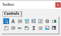
Displays the standard Visual Basic controls plus any ActiveX controls and insertable objects that you have added to your project.

You can customize the Toolbox by adding pages to it or by adding controls by using the Additional Controls command from the Tools menu. When you add a page, a Select Objects tool is always available on the page.
| Button | Icon | Description |
|---|---|---|
| Select Objects | Select Objects is the only item in the Toolbox that doesn't draw a control. When you select it, you can only resize or move a control that has already been drawn on a form. | |
| Label | Allows you to have text that you don't want the user to change, such as a caption under a graphic. | |
| TextBox | Holds text that the user can either enter or change. | |
| ComboBox | Allows you to draw a combination list box and text box. The user can either choose an item from the list or enter a value in the text box. | |
| ListBox | Use to display a list of items from which the user can choose. The list can be scrolled if it has more items than can be displayed at one time. | |
| CheckBox | Creates a box that the user can easily choose to indicate if something is true or false, or to display multiple choices when the user can choose more than one. | |
| OptionButton | Allows you to display multiple choices from which the user can choose only one. | |
| ToggleButton | Creates a button that toggles on and off. | |
| Frame | Allows you to create a graphical or functional grouping for controls. To group controls, draw the frame first, and then draw controls inside the frame. | |
| CommandButton | Creates a button that the user can choose to carry out a command. | |
| TabStrip | Allows you to define multiple pages for the same area of a window or dialog box in your application. | |
| MultiPage | Presents multiple screens of information as a single set. | |
| ScrollBar | Provides a graphical tool for quickly navigating through a long list of items or a large amount of information, for indicating the current position on a scale, or as an input device or indicator of speed or quantity. | |
| SpinButton | A spinner control that you can use with another control to increment and decrement numbers. You can also use it to scroll back and forth through a range of values or a list of items. | |
| Image | Displays a graphical image from a bitmap, icon, or metafile on your form. Images displayed in an Image control can only be decorative and use fewer resources than a PictureBox. |