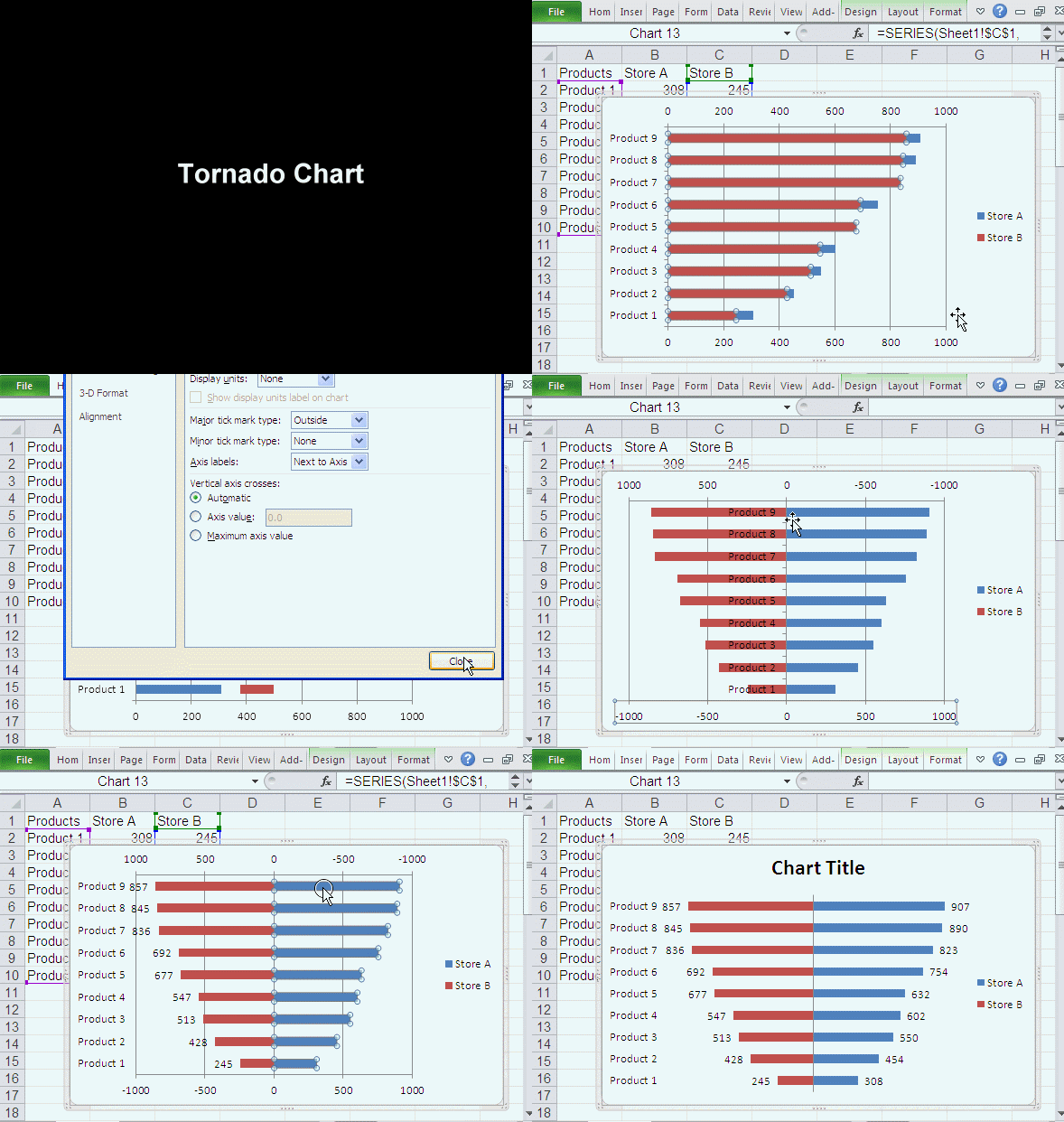
Yesterday, I post how to use Conditional Formatting to create Tornado Chart, today, I'll show you how to use Clustered Bar to create Tornado Chart. Here is our final Tornado Chart:
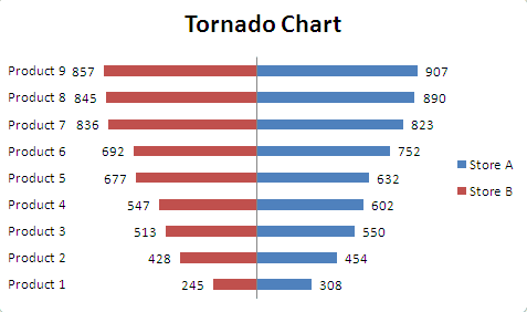
OK, let’s jump straight into creating a Tornado Chart.
Getting the data
In this tutorial, we will compare the sales performance of Store A and Store B. You can copy A1:C10 to a new worksheet to start this tutorial.
|
|
Use Clustered Bar to Create Tornado Chart
- Select A1:C10.
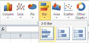
- Under the Insert menu tab, in the Charts group, click the Bar button and choose Clustered Bar in 2-D Bar.
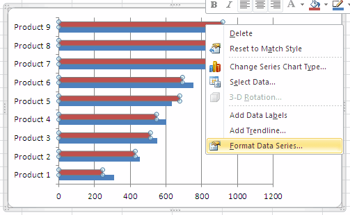
- In Chart Area, Right click any of the Series "Store B" (Red Bar), choose Format Data Series in the quick menu.
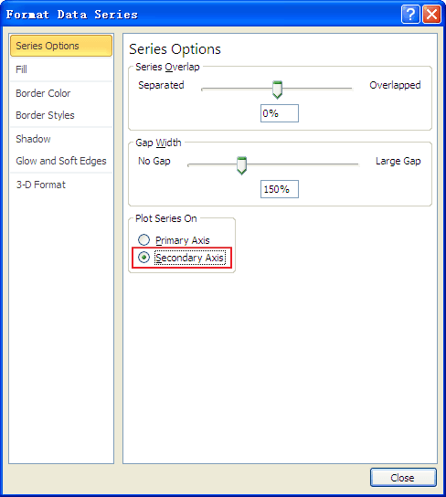
- In the Format Data Series window, under Plot Series On, select Secondary Axis, then click Close.
- In Chart Area, Right click Secondary Horizontal (Value) Axis (in the top of chart), choose Format Axis.
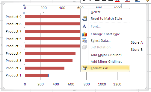
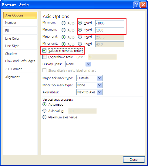
- In Format Axis window, under Axis Options, Minimum: Fixed, -1000, Maximum: Fixed, 1000, and click Values in reverse order, then click Close.
- In Chart Area, Right click Horizontal (Value) Axis (in the bottom of chart), choose Format Axis. Or press CTRL+1.
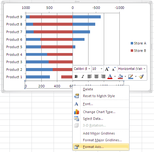
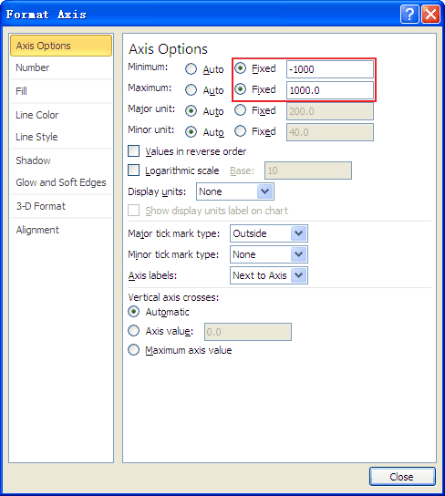
- In Format Axis window, under Axis Options, Minimum: Fixed, -1000, Maximum: Fixed, 1000, then click Close.
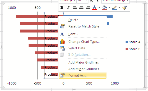
- In Chart Area, Right click Vertical (Category) Axis, choose Format Axis. Or press CTRL+1.
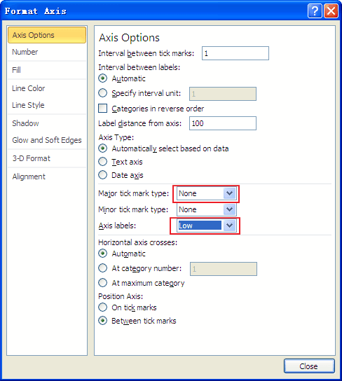
- In Format Axis window, under Axis Options, follow below settings: Major tick mark type: None, Axis labels: Low, then click Close.
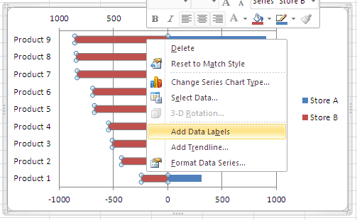
- In Chart Area, Right click Series "Store B", choose Add Data Labels.
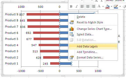
- In Chart Area, Right click Series "Store A", choose Add Data Labels.
- In Chart Area, select Secondary Horizontal (Value) Axis, press Delete, select Horizontal (Value) Axis, press Delete, select Horizontal (Value) Axis Major Gridlines, press Delete. Add chart Title, named with "Tornado Chart" or what you like.
Appreciate your work. Super helpful!
Thanks a lot for your tutorial
Thank you! This is very helpful