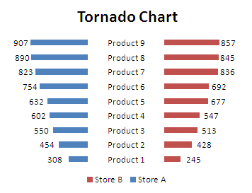
There's many ways to create Tornado Chart, I'll share with you another example, see the final chart:

This chart is really looks like a butterfly. OK, let’s jump straight into creating a Butterfly Chart.
Download and Install The XY Chart Labeler
The XY Chart Labeler is a useful Add-ins to add, move, manage and delete the chart labels, you can download here: The XY Chart Labeler. You need to restart your Excel to activate this Add-ins.
Getting the data
In this tutorial, we will compare the sales performance of Store A and Store B. See below table.
|
|
Add helper column
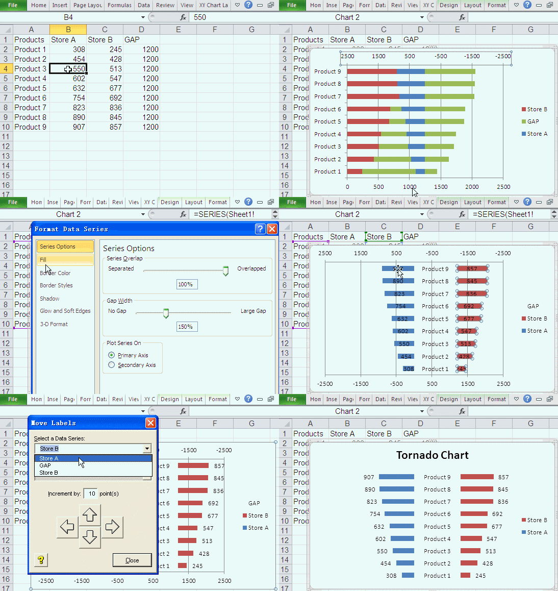
We'll add one helper column to our data, named "Gap", it'll display products labels in our Tornado Chart. You can change the Gap values to fit your category names width. see below table. Copy A1:D10 to a new worksheet to start our tutorial.
|
|
Create Tornado Chart
- Select A1:D10 or select any cell of range A1:D10.
- Under the Insert menu tab, in the Charts group, click the Bar button and choose Stacked Bar in 2-D Bar.
- In Chart Area, Right click any of the Series "Store A" (Blue Bar), choose Format Data Series in the quick menu.
- In the Format Data Series window, under Plot Series On, select Secondary Axis, then click Close.
- In Chart Area, Right click Secondary Horizontal (Value) Axis (in the top of chart), choose Format Axis.
- In Format Axis window, under Axis Options, Minimum: Fixed, -2500, Maximum: Fixed, 2500, and click Values in reverse order, then click Close.
- In Chart Area, Right click Horizontal (Value) Axis (in the bottom of chart), choose Format Axis. Or press CTRL+1.
- In Format Axis window, under Axis Options, Minimum: Fixed, -2500, Maximum: Fixed, 2500, then click Close.
- In Chart Area, Right click and choose Select Data.
- In Select Data Source window, select Gap series, click Move Up once.
- In Chart Area, select Vertical (Category) Axis press Delete.
- In Chart Area, select Series "GAP", press CTRL+1.
- In Format Data Series window, click Fill tab, click No Fill, then click Close.
- In Chart Area, Right click Series "GAP", choose Add Data Labels.
- Select Series "GAP" Data Labels, press CTRL+1, in Label Options, under Label Contains, select Category Name, and deselect Value, then click Close
- In Chart Area, Right click Series "Store A", choose Add Data Labels.
- In Chart Area, Right click Series "Store B", choose Add Data Labels.
- Select Series "Store A" Data Labels, under the XY Chart Labels menu tab, in the Charts Labels group, click the Move Labels button. In Move Labels window, click Left Arrow button to move the Series "Store A" Data Labels.
- Select Series "Store B" Data Labels, under the XY Chart Labels menu tab, in the Charts Labels group, click the Move Labels button. In Move Labels window, click Right Arrow button to move the Series "Store B" Data Labels.
- In Chart Area, select Secondary Horizontal (Value) Axis, press Delete, select Horizontal (Value) Axis, press Delete, select Horizontal (Value) Axis Major Gridlines, press Delete. Add chart Title, named with "Tornado Chart" or what you like.

Great Help and good informative video
Hi,I check your blog named "How To Create Tornado Chart (Butterfly Chart) - Excel How To" regularly.Your writing style is awesome, keep up the good work! And you can look our website about proxy list.
Thank you. Very useful
i need to know how to make a cart for tornadoes
This was really useful, thank you!
@Pauline cool i dont know if you know any info on tornadoes so i can teach my class next year...thanks for helping me