When you create a chart to analyze the trend of the data, it is useful to add a horizontal Average Line across the chart, so that you can compare the data clearly and easily. In this tutorial, I'll show you how to add an Average Line to Column Chart in Excel 2010.
Add a New Average Value Column
In this example, we have a group of sales data (range A1:B7). You may copy A1:C7 to a new Worksheet to start this tutorial.
|
|
We want to display the average sales for the group in our chart, so we need to insert a new Helper Column that we called Average. We'll use Average function to calculate the average of entire group. In Column C2, type this formula:
=AVERAGE($B$2:$B$7)then drag down to C7.
Create Chart
- Select range A1:C7.
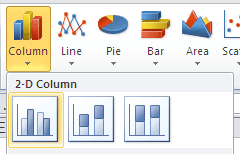
- Under the Insert menu tab, in the Charts group, click the Column button and choose Clustered Column in 2-D Column.
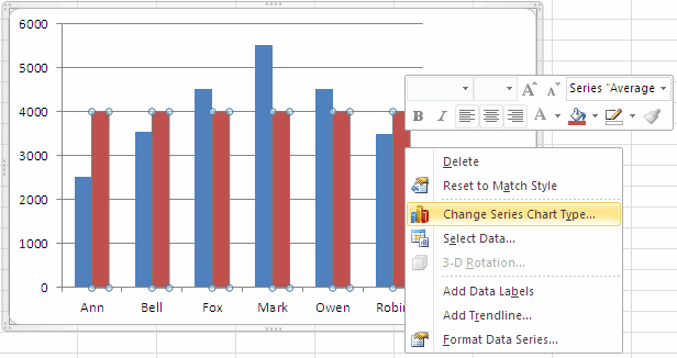
- Right-click any of the columns in the Average series on the chart, In the quick menu, click Change Series Chart Type…
- In the Change Chart Type dialog, choose a basic Line chart.
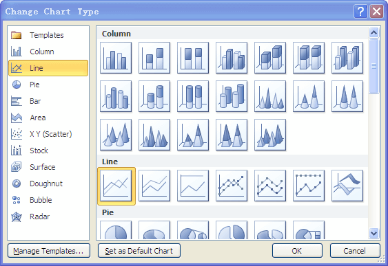
- click OK.
Formatting Series "Average"
- Select the chart, this displays Chart Tools.
- On the Layout tab, in the Current Selection group, click the arrow next to the Chart Elements box, and then click Series "Average".

- Press CTRL+1.
- On the Series Options tab, under Plot Series On, click Secondary Axis, then Click Close.

Formatting Secondary Horizontal Axis
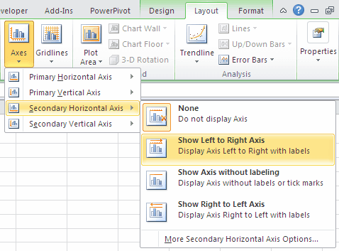
- On the Layout tab, in the Axes group, click Axes.
- Click Secondary Horizontal Axis, and then click Show Left to Right Axis.
- Select Secondary Horizontal (Category) Axis.
- Press CTRL+1. The Format Axis dialog box is displayed.
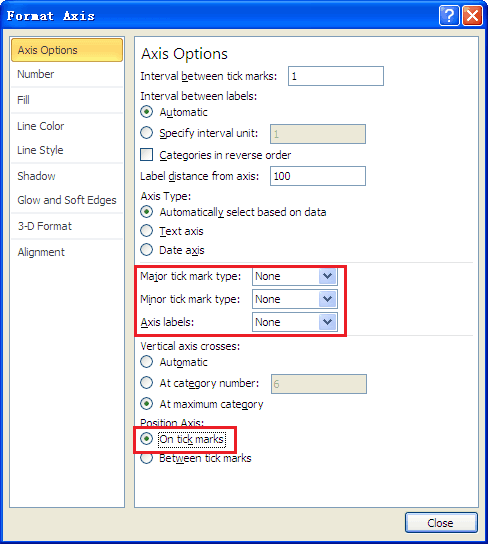
- On the Axis Options tab, In Major tick mark type, select None. In Axis labels, select None. under Position Axis, click On tick marks, then Click Close.
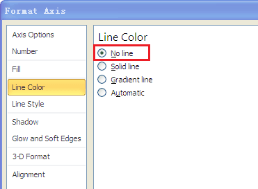
- On the Line Color tab, under Line Color, click No line.
- Click Close.
Formatting Vertical (Value) Axis
- Select Vertical (Value) Axis.
- Press CTRL+1. The Format Axis dialog box is displayed.
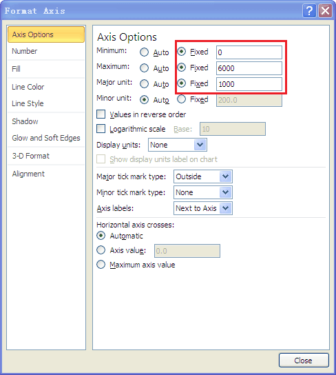
- On the Axis Options tab, under Axis Options, in Minimum, click Fixed, input value 0, in Maximum, click Fixed, input value 6000, in Major unit, click Fixed, and input value 1000.
- Click Close.
Formatting Secondary Vertical (Value) Axis
- Select Secondary Vertical (Value) Axis.
- Press CTRL+1. The Format Axis dialog box is displayed.
- On the Axis Options tab, under Axis Options, in Minimum, click Fixed, input value 0, in Maximum, click Fixed, input value 6000, in Major unit, click Fixed, and input value 1000. In Major tick mark type, select None. In Axis labels, select None.
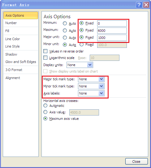
- On the Line Color tab, under Line Color, click No line.

- Click Close.
Formatting Average Point Label
- Select Series "Average".
- Click Series "Average" Point "Robin" (the last point).
- Right-click, in the quick menu, select Add Data Label.
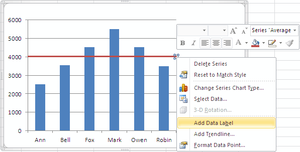
- Press CTRL+1. The Format Data Point dialog box is displayed.
- On the Marker Options tab, under Marker Type, select Built-in, then select a type, in this example we select Round.
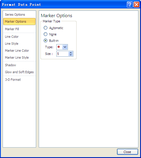
- Click Close.
At this point, all the major steps completed, your chart will looks like this:
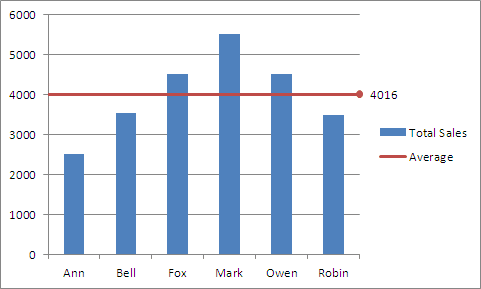
You may add the Chart Title or delete Major Gridlines and Legend to make it more beautiful. If you use Excel 2013, all the steps will be clearly and easily, just do it.