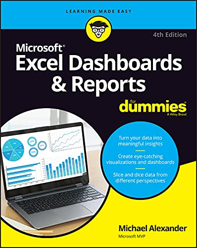
Excel Dashboards & Reports For Dummies, 4th Edition
- Length: 384 pages
- Edition: 4
- Language: English
- Publisher: For Dummies
- Publication Date: 2022-04-05
- ISBN-10: 1119844398
- ISBN-13: 9781119844396
Book Description
It’s time for some truly “Excel-lent” spreadsheet reporting
Beneath the seemingly endless rows and columns of cells, the latest version of Microsoft Excel boasts an astonishing variety of features and capabilities. But how do you go about tapping into some of that power without spending all of your days becoming a spreadsheet guru?
It’s easy. You grab a copy of the newest edition of Excel Dashboards & Reports For Dummies and get ready to blow the pants off your next presentation audience!
With this book, you’ll learn how to transform those rows and columns of data into dynamic reports, dashboards, and visualizations. You’ll draw powerful new insights from your company’s numbers to share with your colleagues – and seem like the smartest person in the room while you’re doing it.
Excel Dashboards & Reports For Dummies offers:
- Complete coverage of the latest version of Microsoft Excel provided in the Microsoft 365 subscription
- Strategies to automate your reporting so you don’t have to manually crunch the numbers every week, month, quarter, or year
- Ways to get new perspectives on old data, visualizing it so you can find solutions no one else has seen before
If you’re ready to make your company’s numbers and spreadsheets dance, it’s time to get the book that’ll have them moving to your tune in no time. Get Excel Dashboards & Reports For Dummies today.
Table of contents
Chapter 1: Getting in the Dashboard State of Mind

Part 1: Getting Started with Excel Dashboards and Reports
Chapter 2: Building a Super Model
Chapter 3: The Pivotal Pivot Table
Chapter 4: Using External Data for Your Dashboards and Reports

Part 2: Building Basic Dashboard Components
Chapter 5: Dressing Up Your Data Tables
Chapter 6: Sparking Inspiration with Sparklines
Chapter 7: Formatting Your Way to Visualizations

Part 3: Adding Charts to Your Dashboards
Chapter 8: Charts That Show Trending
Chapter 9: Grouping and Bucketing Data
Chapter 10: Displaying Performance against a Target

Part 4: Advanced Reporting Techniques
Chapter 11: Giving Users an Interactive Interface
Chapter 12: Adding Interactivity with Pivot Slicers
Chapter 13: Sharing Your Workbook with the Outside World

Part 5: The Part of Tens
Chapter 14: Ten Chart Design Principles
Chapter 15: Ten Questions to Ask Before Distributing Your Dashboard
About The Author
Michael Alexander
Mike Alexander is a Microsoft Certified Application Developer (MCAD) and author of several books on advanced business analysis with Microsoft Access and Excel. He has more than 16 years’ experience consulting and developing Office solutions. Mike has been named a Microsoft MVP for his ongoing contributions to the Excel community. You can visit Mike at www.datapigtechnologies.com, where he regularly shares Excel and Access tips and techniques.


